Are you trying to find techniques to become a better web designer? We’ve compiled 13 guidelines to assist in directing your creative development. You can always get better at what you do, regardless of how experienced you are in web design or how many websites you have built. Know more about website design company malaysia.
Pointers can assist you to improve your abilities and fortify your design work.
- Steer clear of busy colour schemes
It’s simple to overuse colour when so many gorgeous tones and colours are available. While many designers’ aesthetics revolve around bright and dramatic colour schemes, the visual chaos that results from placing too many colours too close together overwhelms the rest of the site design.
Maintain a muted backdrop colour scheme and a basic colour scheme. Colours used in call-to-action buttons, menu items, and other design components stand out and attract attention when contrasted with a subdued backdrop.
- Give careful consideration to the pictures you use
A website’s overall appearance and feel are greatly influenced by the photographs used in the web design layout. Even the most brilliant ideas can be undermined by badly taken photos with hazy focus and dubious composition. Generic stock images can kill a design’s soul, making it lifeless and dull.
- Acquire SEO knowledge
We know that you didn’t dedicate your time to learning the craft of web design to worry about search engine optimisation. However, SEO may be greatly impacted by the way a website is designed.

- Make use of responsive design
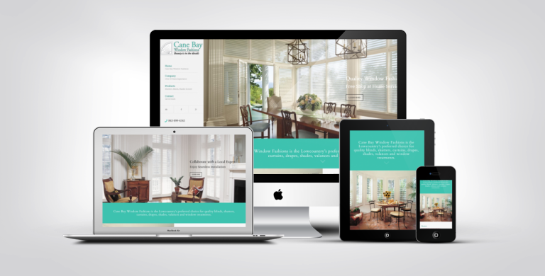
There are several gadgets with different screen sizes available. Your website should provide a consistent experience on all devices, regardless of how someone accesses it. It would be preferable to use that time to improve UI and UX for everyone rather than expending a great deal of effort on really complicated animations and hover effects that might not function on every device.
- Maintain a standardized font
We anticipate a book will have a particular arrangement on each page when we read it. The text will have consistent dimensions, precise spacing, and a recurring structure. This feeling of consistency keeps us interested and provides a continuous reading experience.
Similarly, a web design’s typography must have coherence and organisation. A website’s headers, body text, links, and other information must all have consistent styling from one page to the next.


